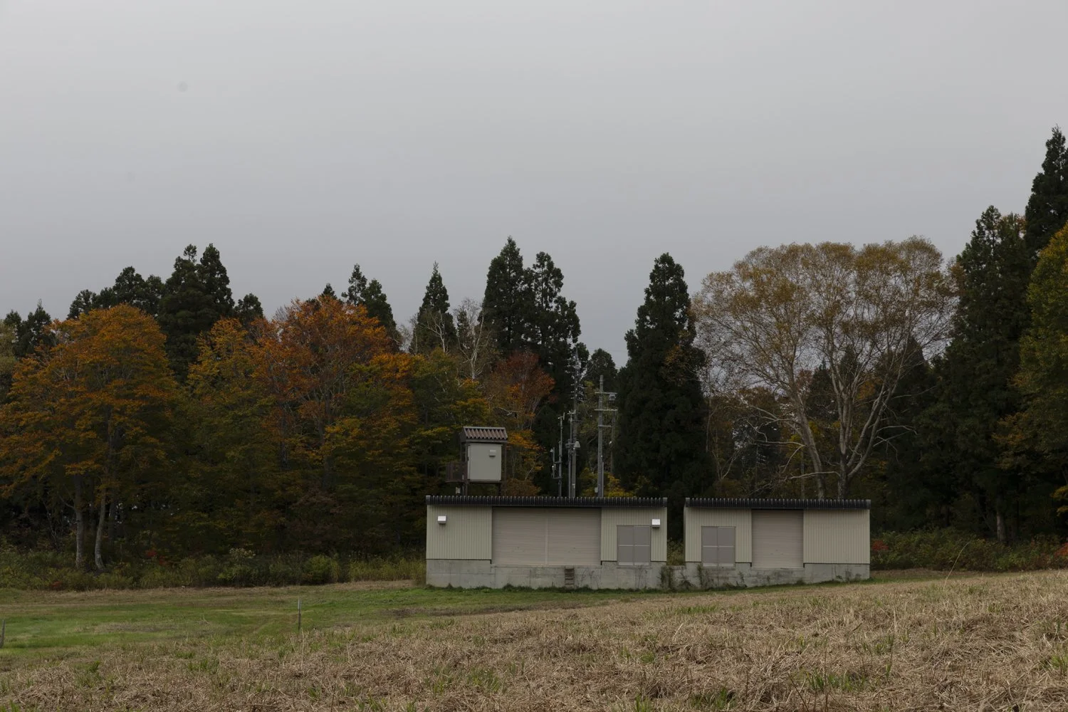
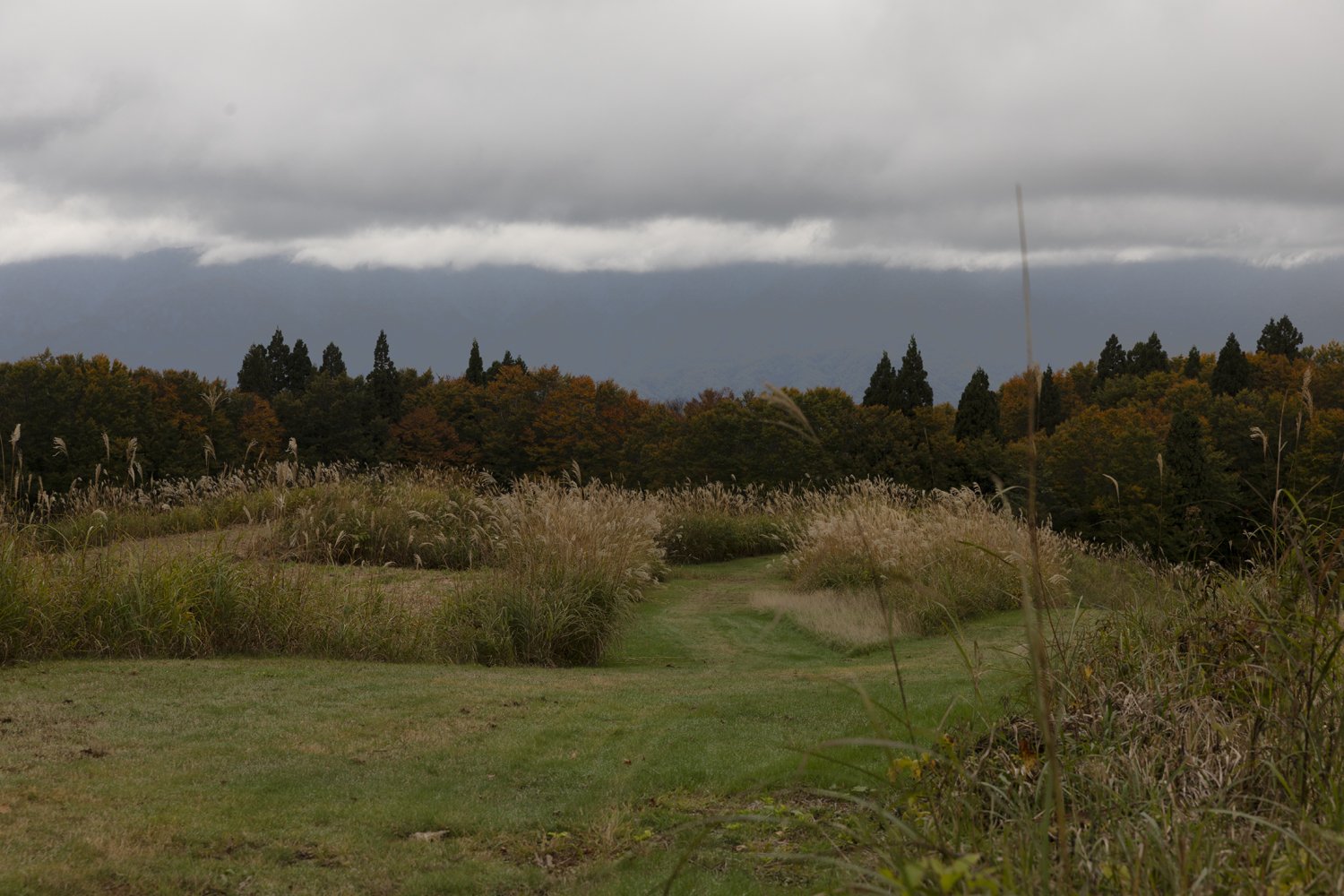
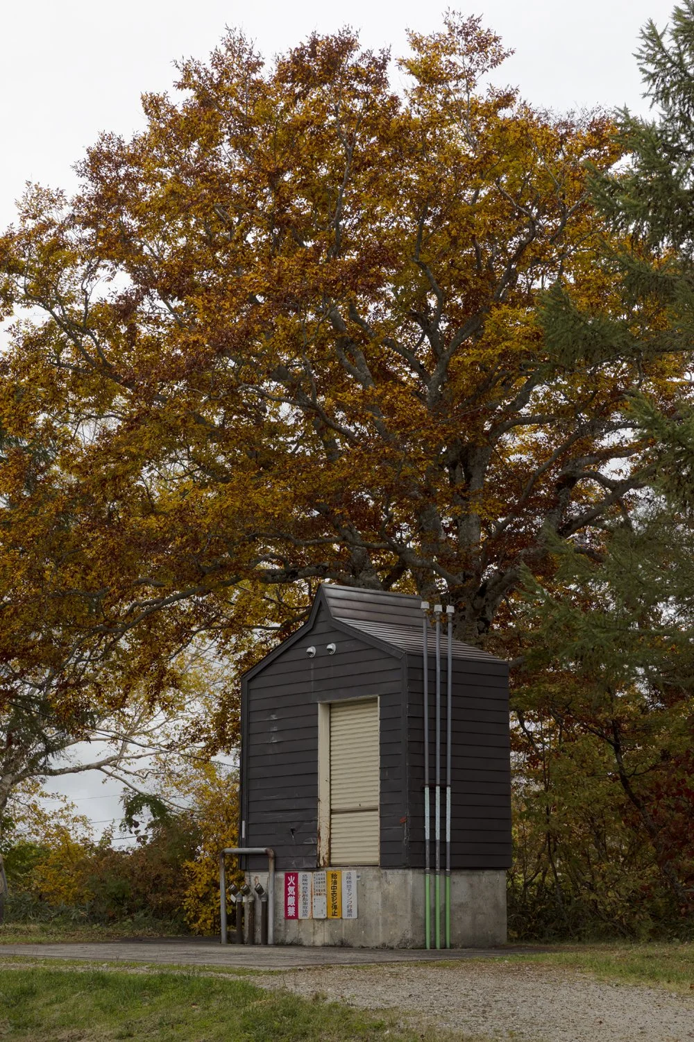
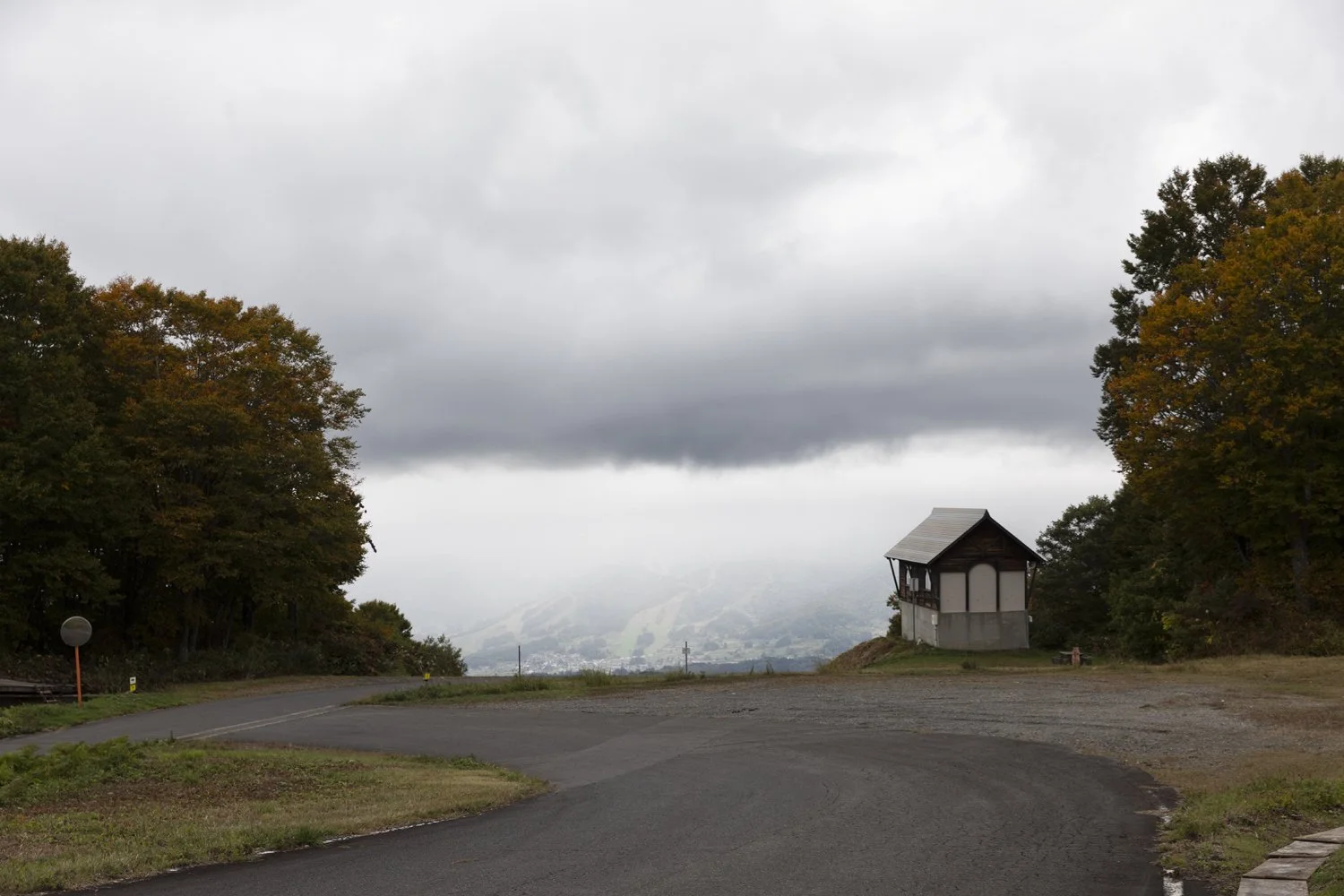
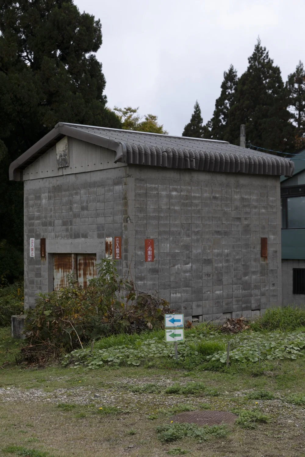
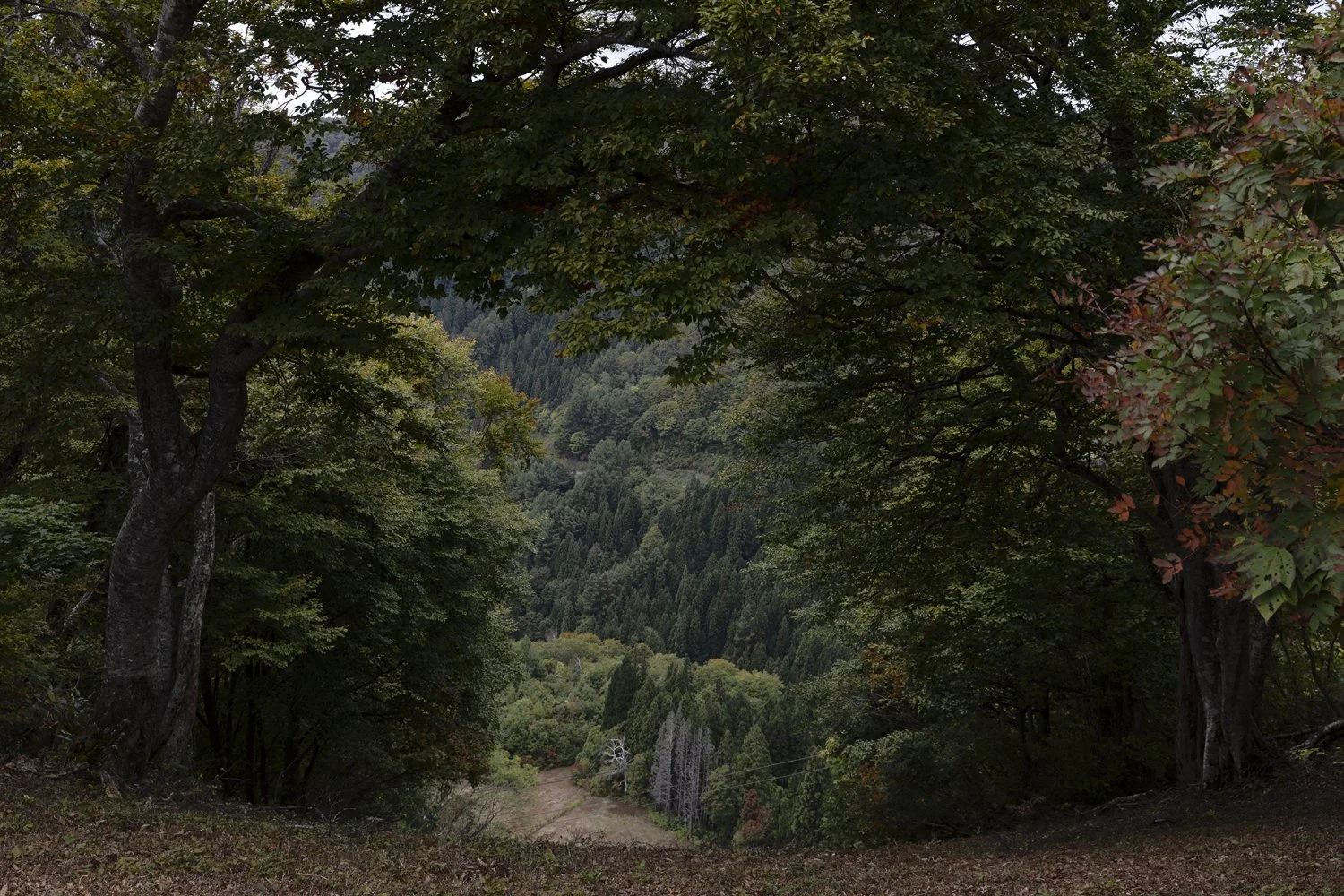
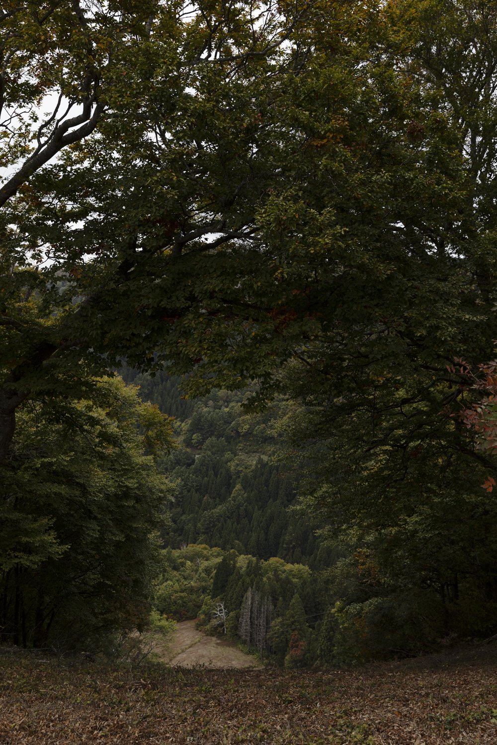
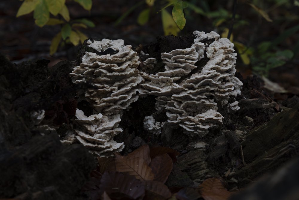
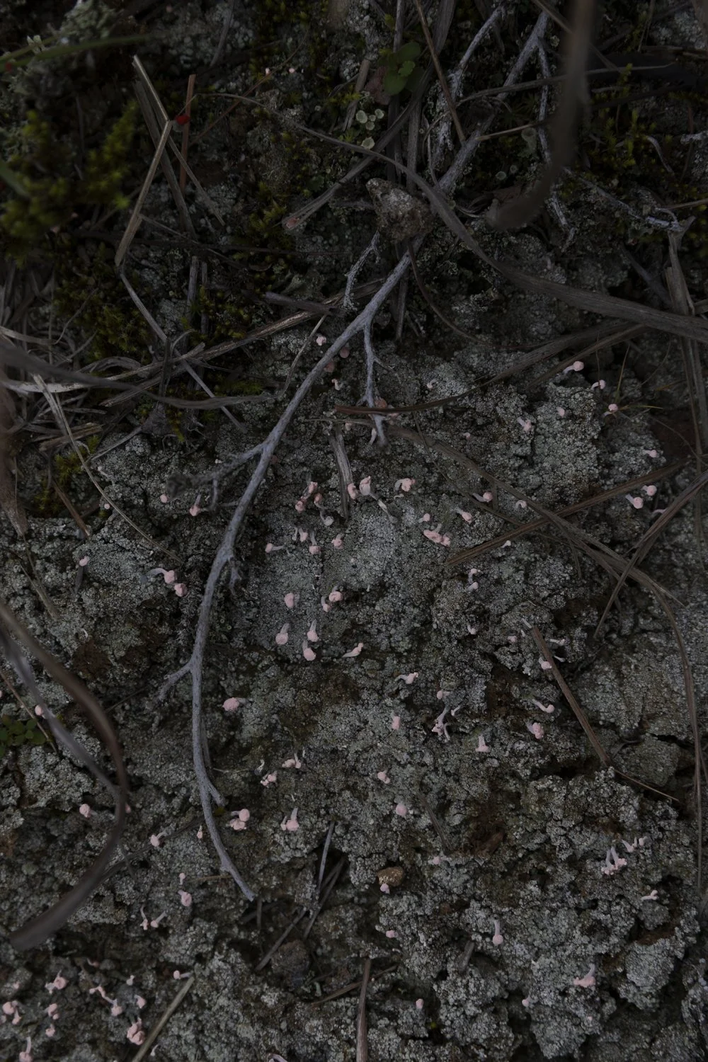
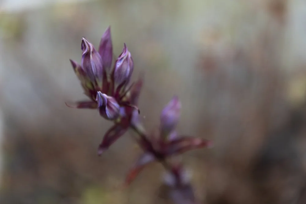
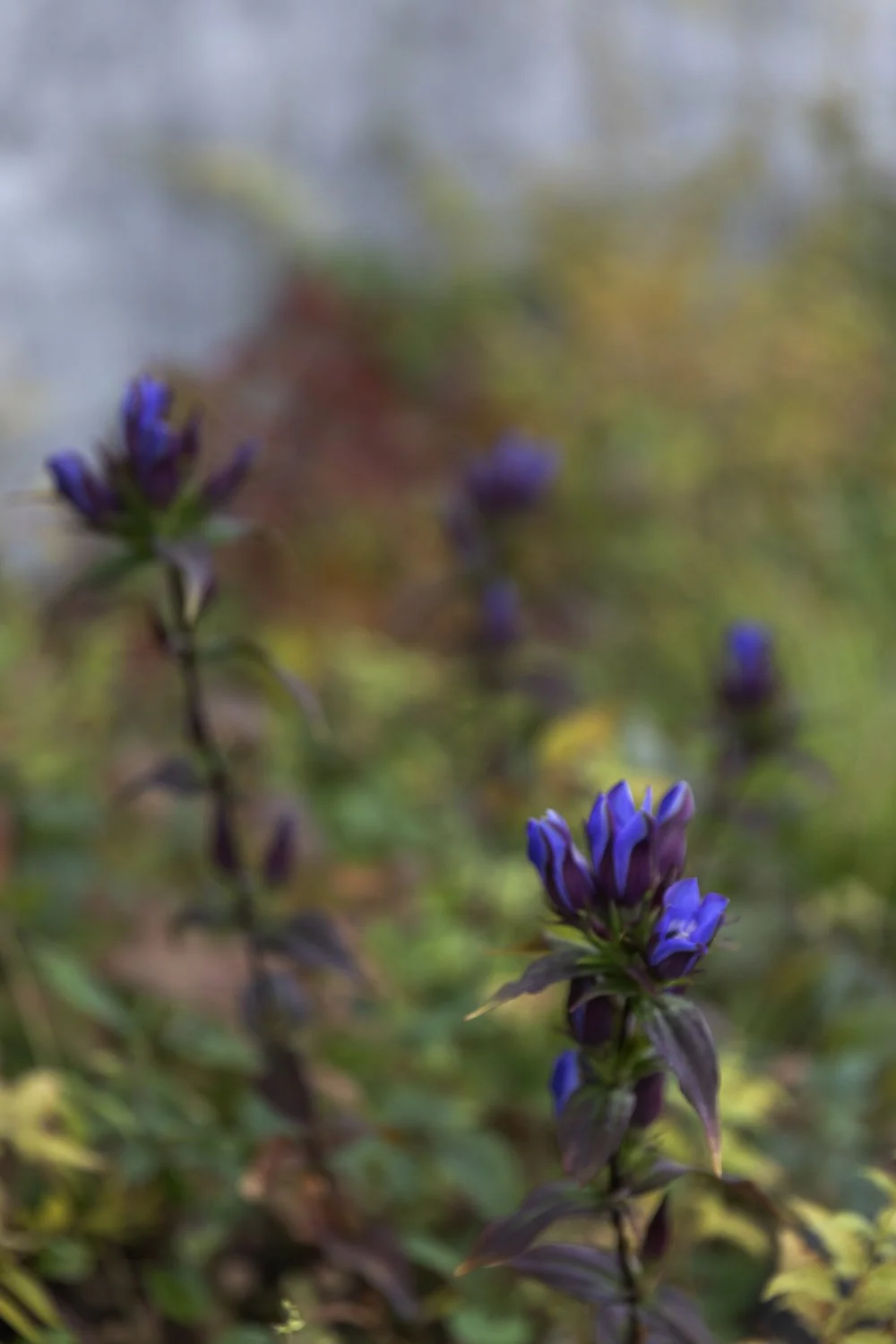
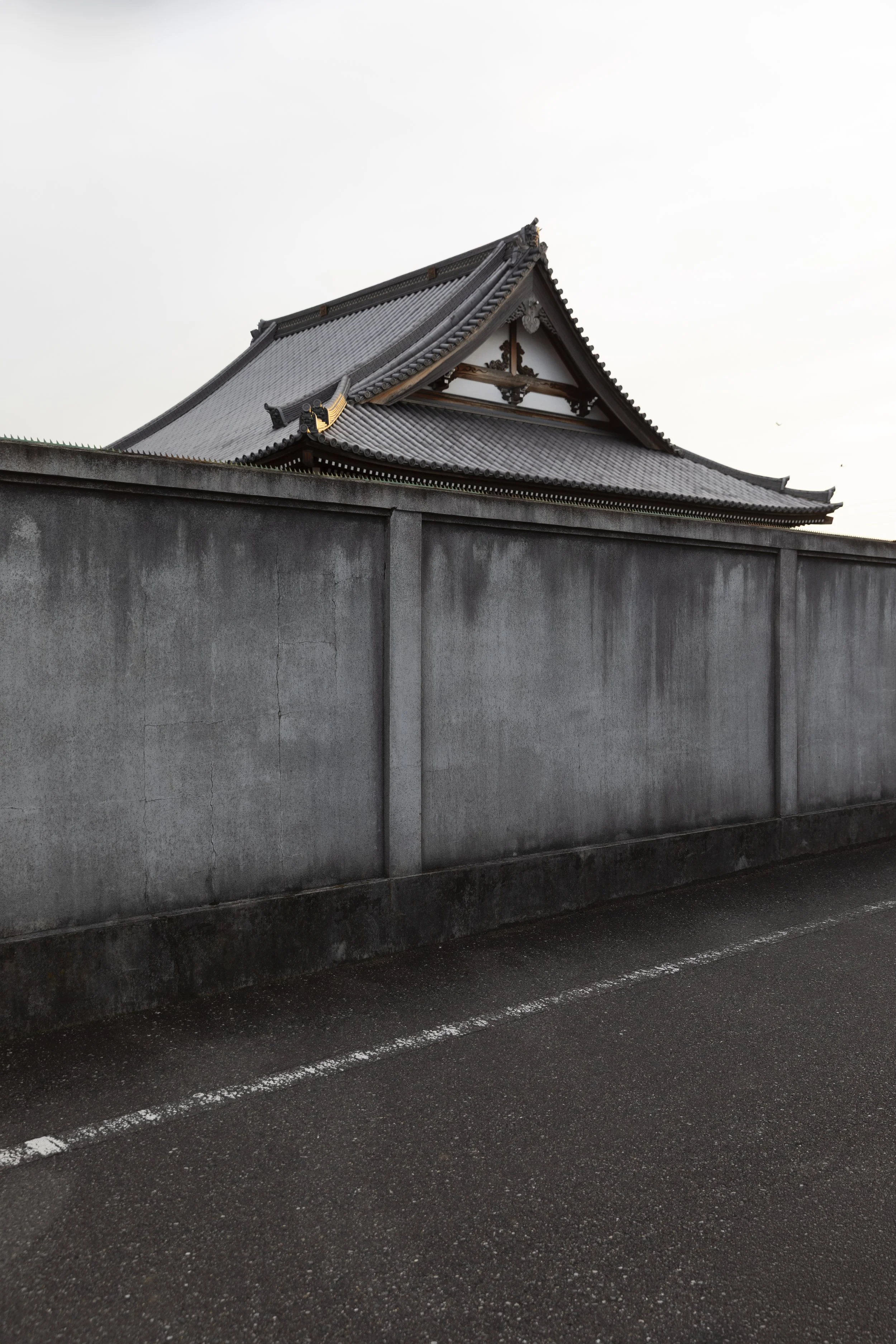
Another little collection from my 2025 Japan travels - this time from high in the mountains behind the gorgeous alpine village of Nozawaonsen.
Travel
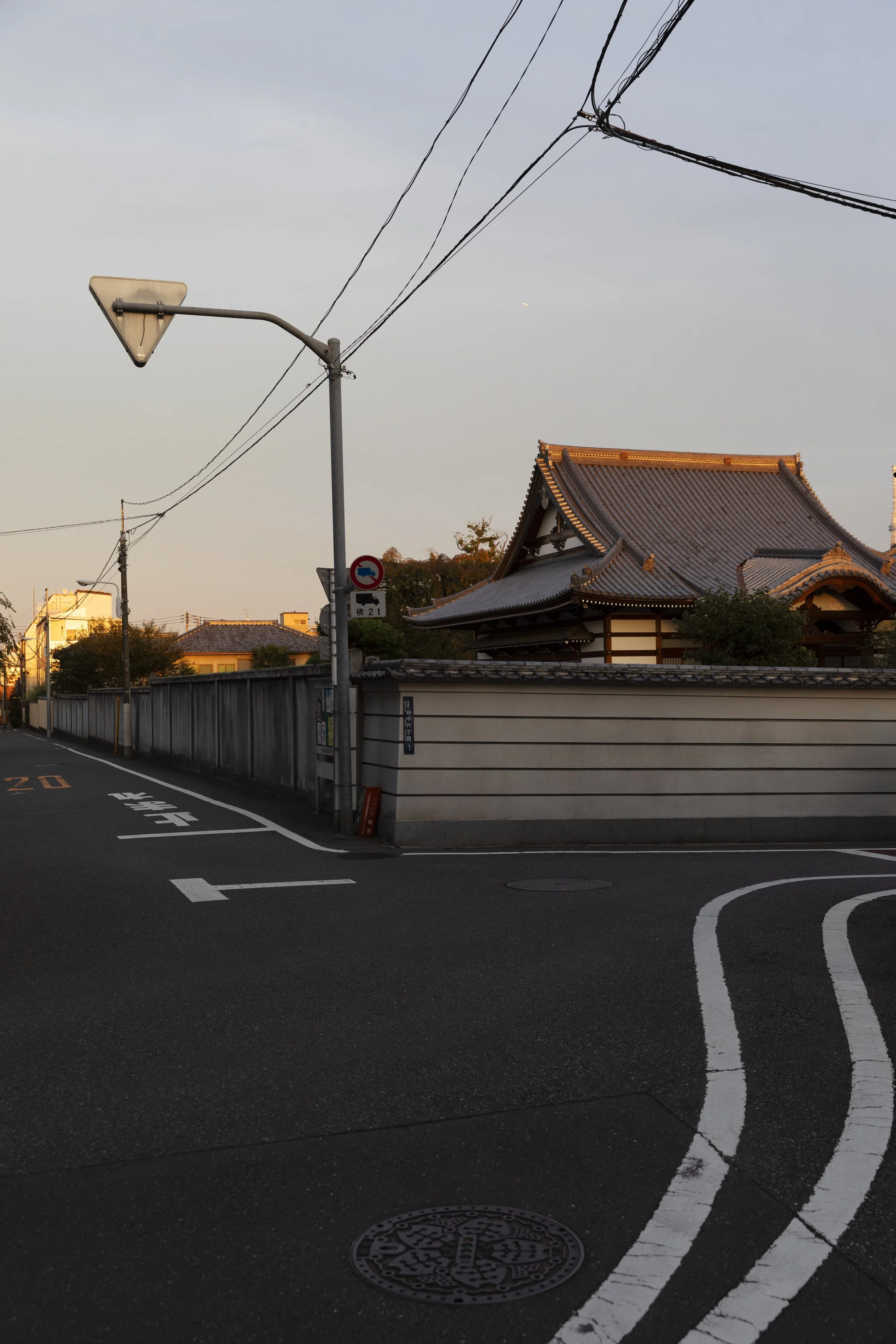
A little bit of temple and a lot of concrete wall
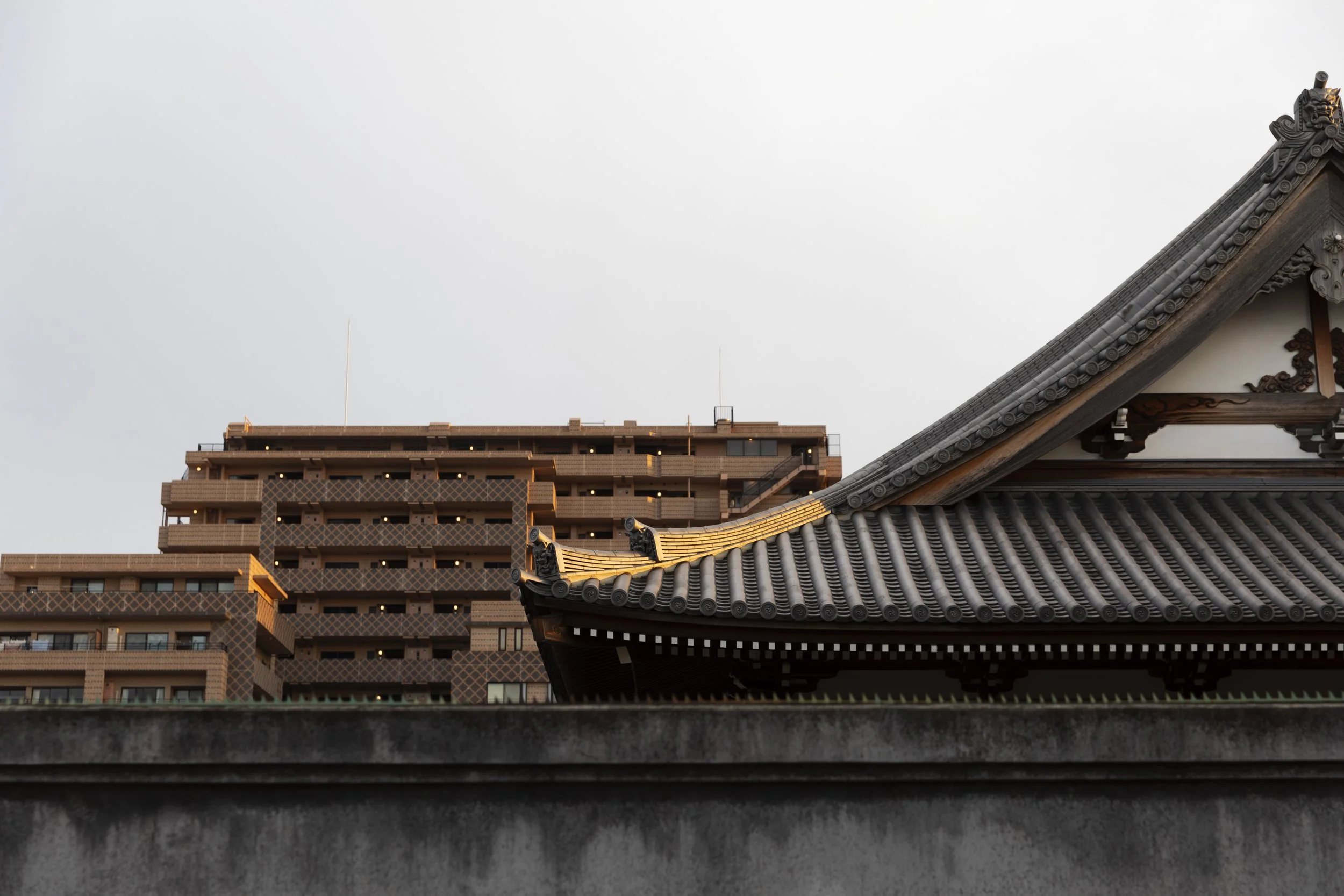
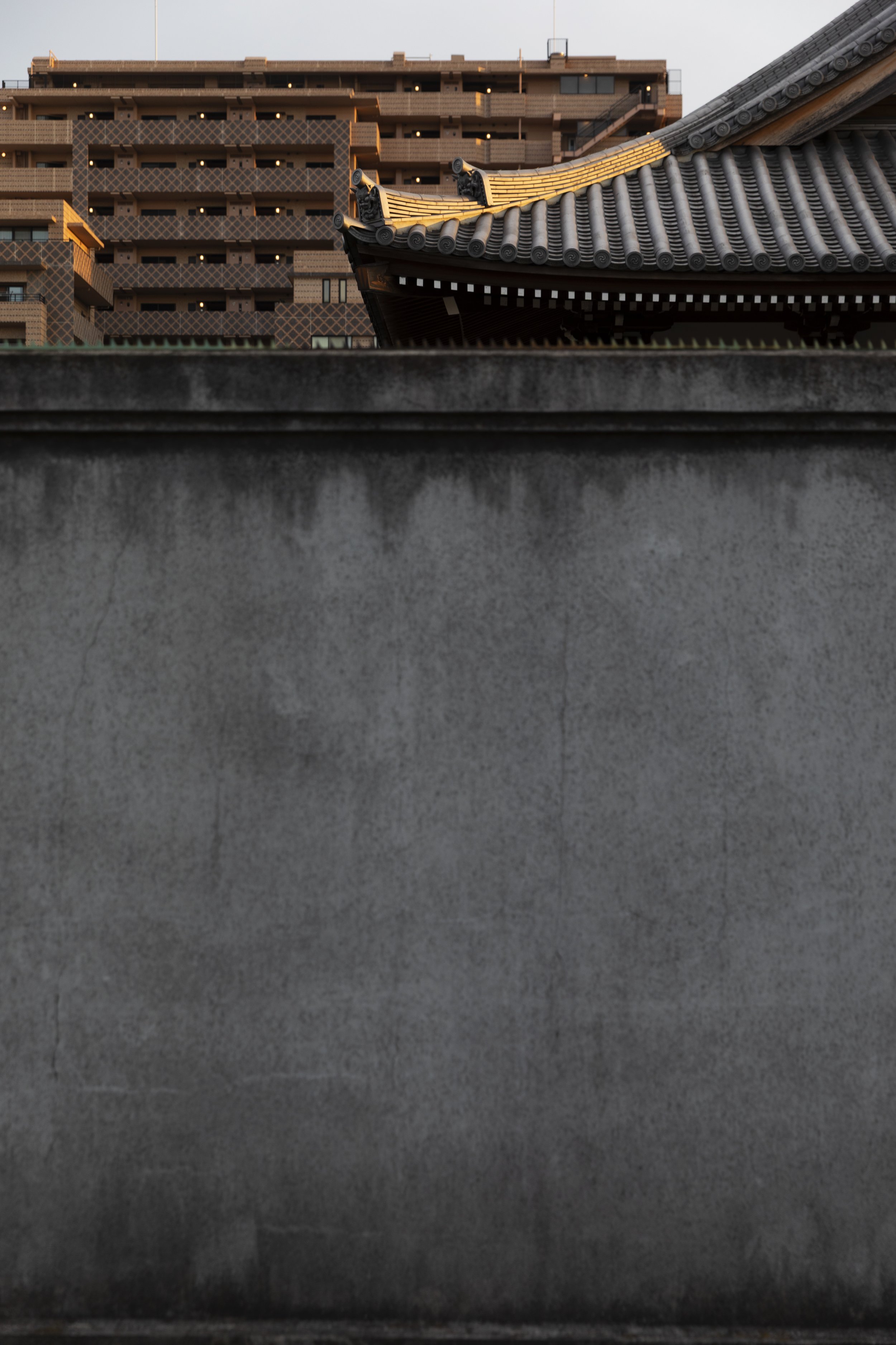
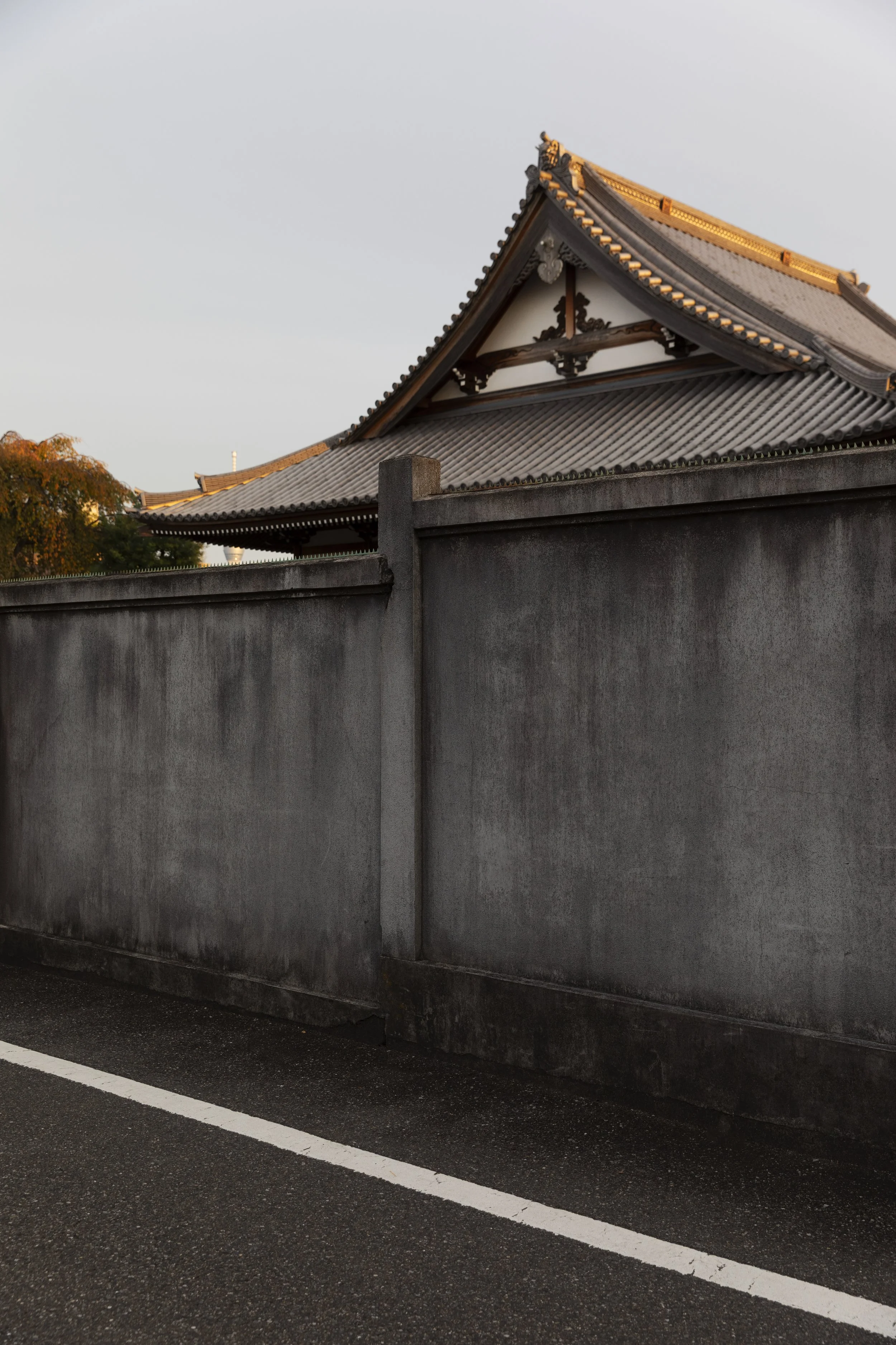
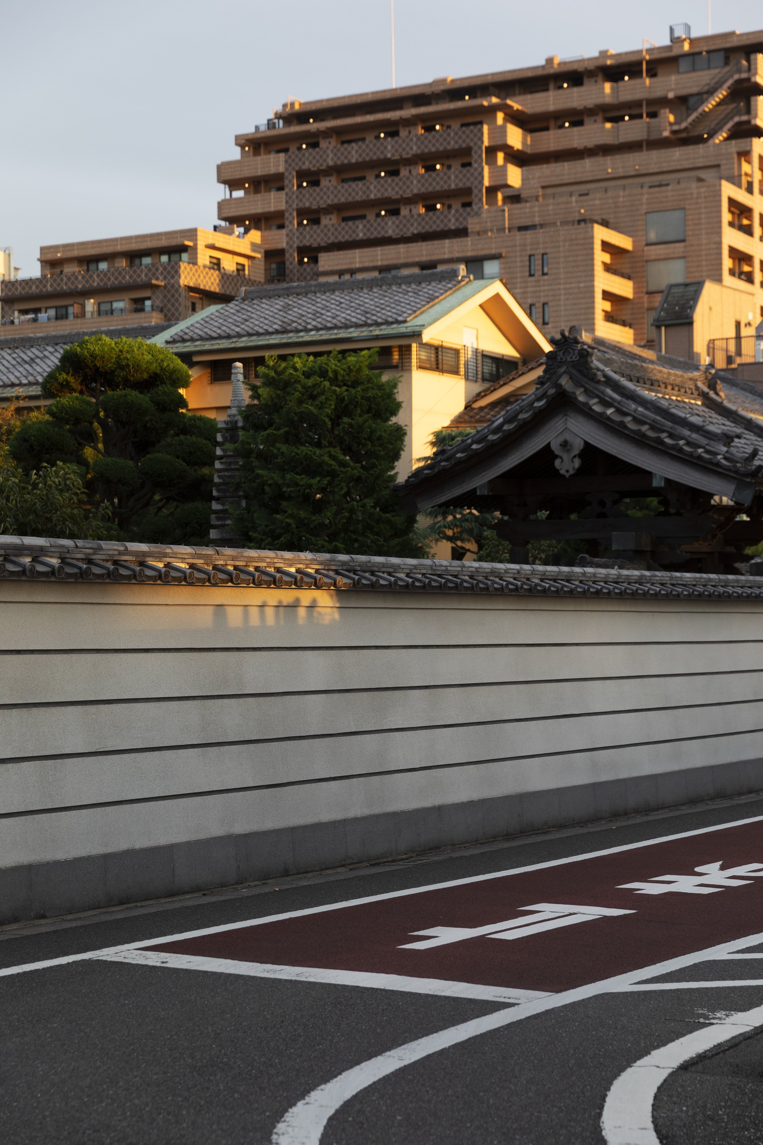
I spent over a week exploring Tokyo (barely scratched the surface) and of all of the areas I spent time in, I’m going to say Yanaka was my favourite. It’s part of Tokyo’s “Old Town” and known for the high concentration of temples (70 something in Yanaka.) This little collection of photos includes a small part of one of those temples but is about the gorgeous surrounding concrete wall..! I love it. If you’ve been following for a while or you scroll back a few years, you’ll know, or find, that it’s not the first time I’ve professed my love for a wall and a concrete one at that.
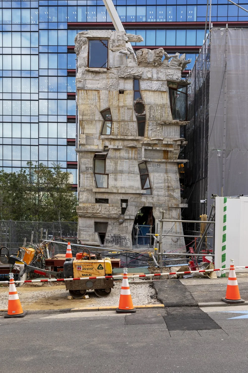
Arimasuton. Tokyo’s "Zombie Fish" Building
You may or may not know that I jetted off to Japan for two weeks last year. As you can imagine, I took a lot of photos. How to share them with you has perplexed me a bit as there are many ways I could shape them into little collections. I still haven’t come to any great conclusion so I thought I’d just begin. And begin with something very unique!
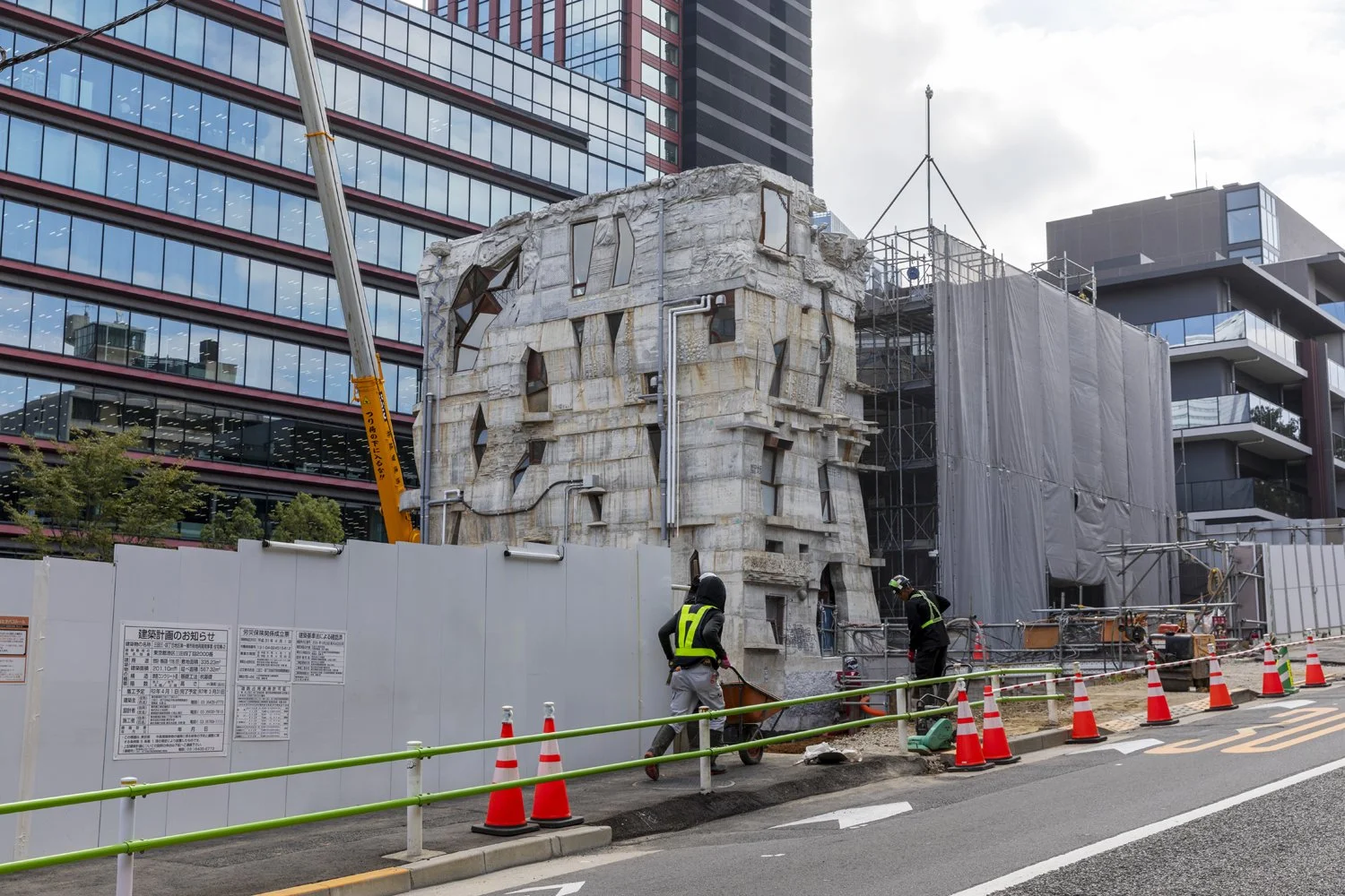
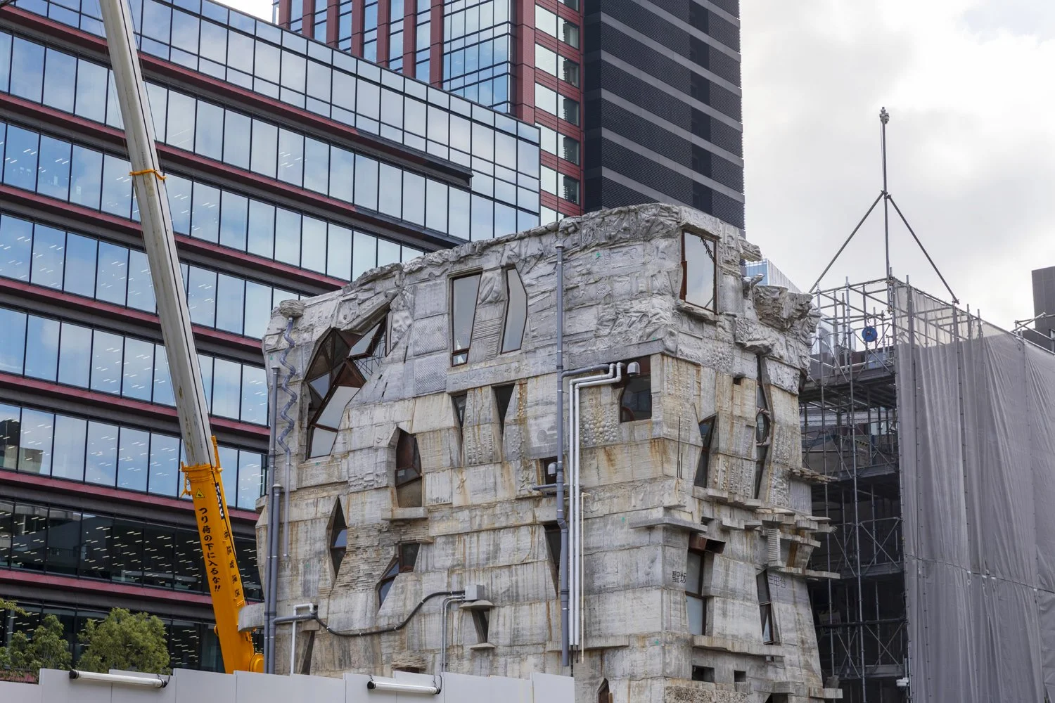
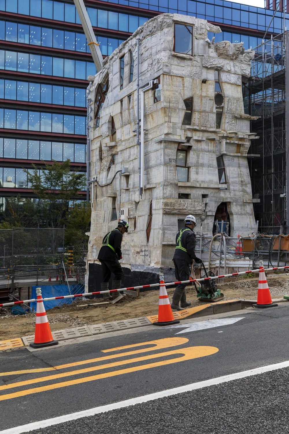
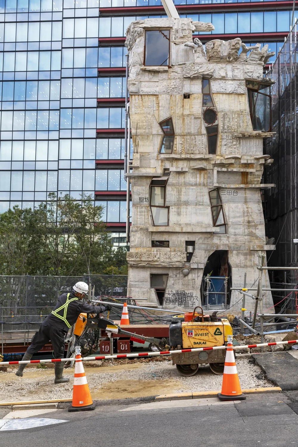
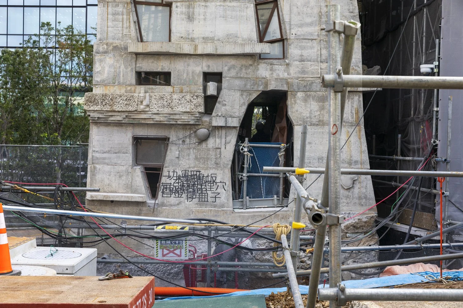
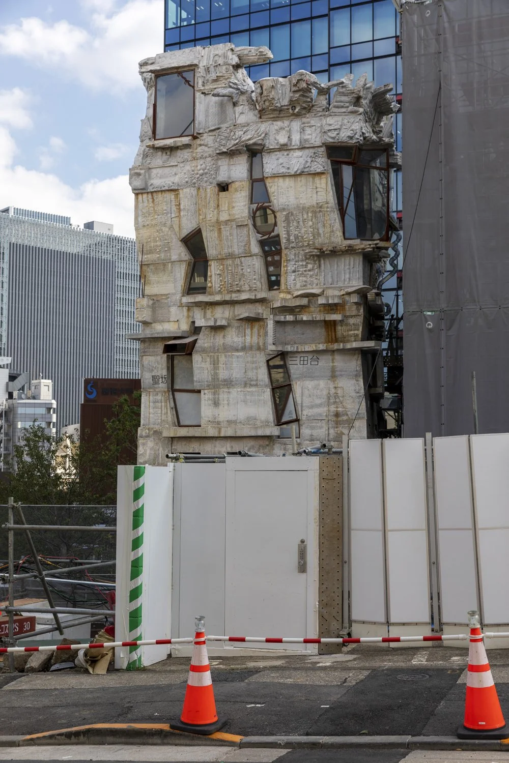
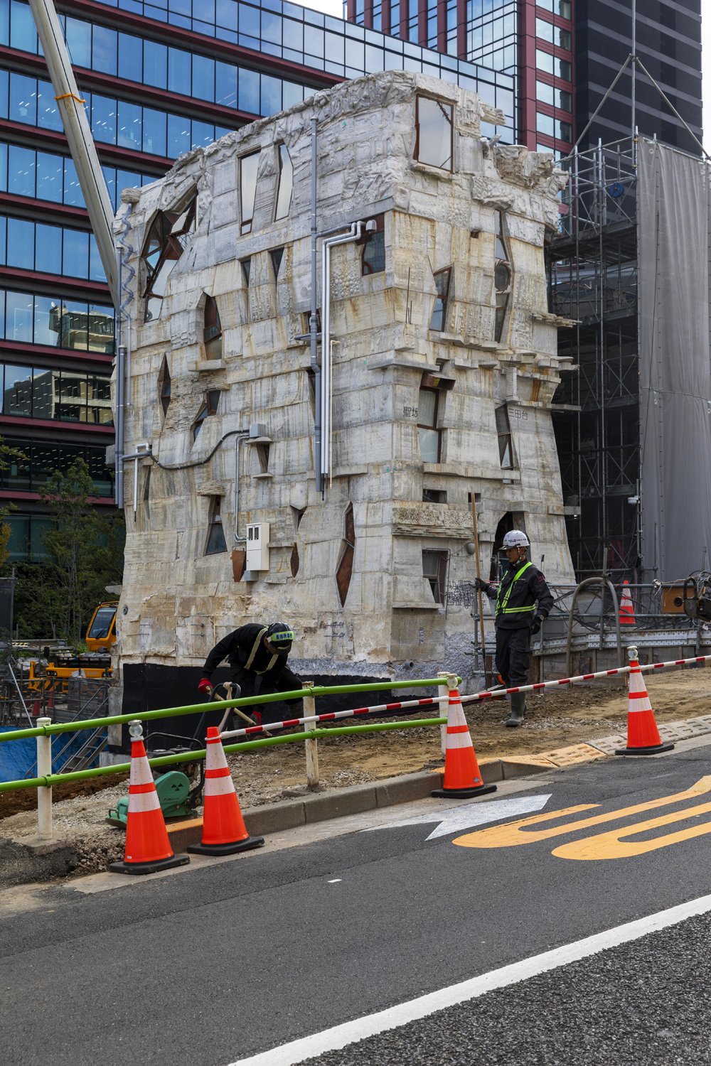
This is Arimasuton, Tokyo’s "Zombie Fish" Building and a handmade, concrete masterpiece. Tokyo’s small scale, lesser known answer to Gaudí, if you like.
Architect Keisuke Oka is the owner and builder of Arimasuton, which can be found in Tokyo’s Mita district, a lavish and upscale suburb where the building stands out and strangely fits in too. For over twenty years Keisuke, along with friends, family, students and neighbours, has crafted the building by hand, from concrete.
Though finished in 2024 the surrounding buildings have been demolished making way for a large-scale development leaving Oka no choice but to shift, yes actually shift, the building back 10 metres away from the construction site, which is what is taking place in my images below. I did attempt to get closer but was quickly ushered away by the polite security guarding the site. I am looking forward to revisiting in the future to see it settled and likely dwarfed amongst it’s future giant neighbours!
Lanson Place Hotel
There’s a new hotel in Melbourne town, the Lanson Place Hotel and it’s been decked out from head to toe with art by the formidable team at Curatorial+Co, led by the most formidable and inspiring Sophie Vander. We spent a full and fun day together last month ahead of the hotel’s opening capturing the beautiful artworks, many of which are by my friend and amazing artist Kate Banazi - this whole project - a coming together of excellent people, doing fabulous creative things. Here are some highlights… too many to share them all.
Duality
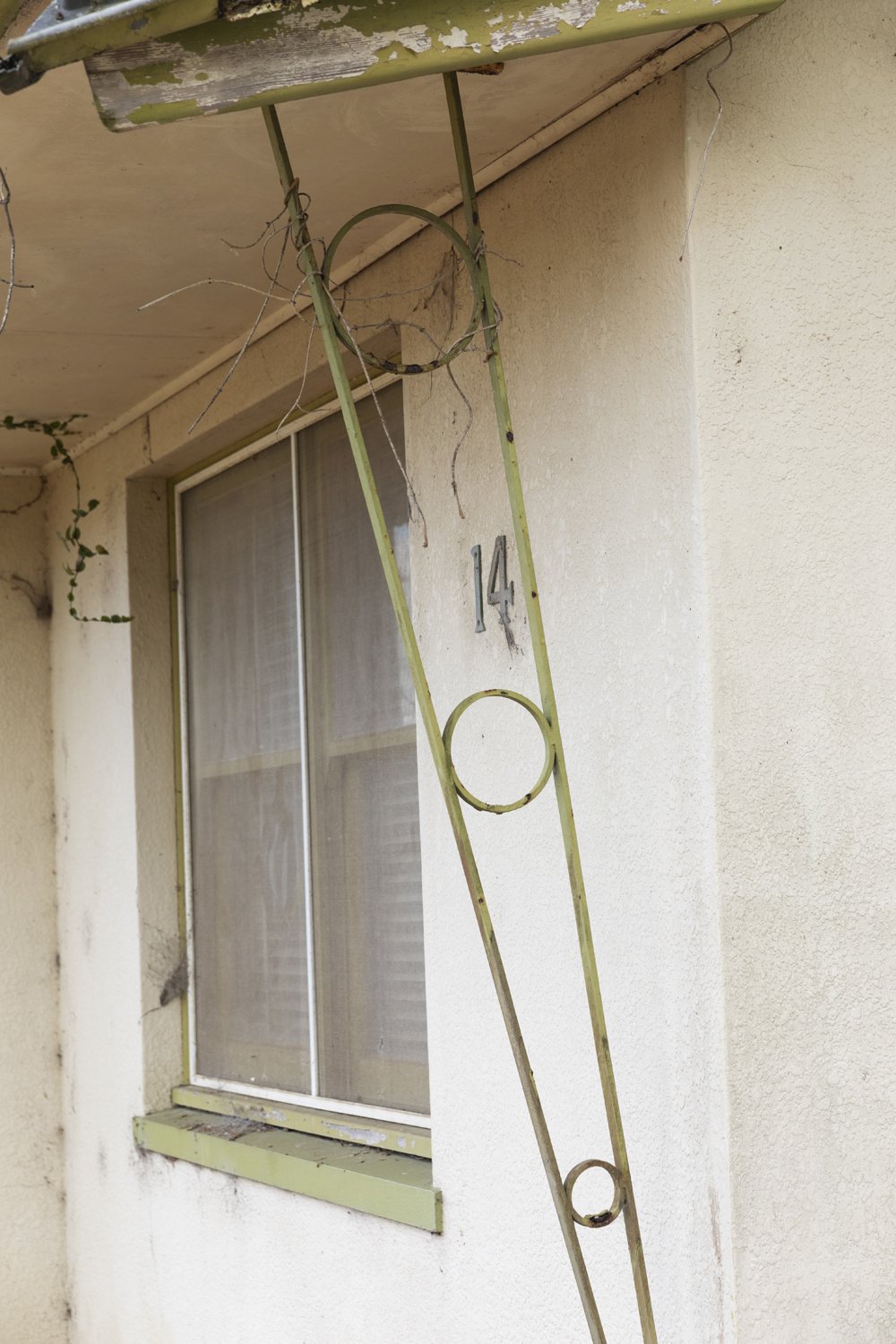
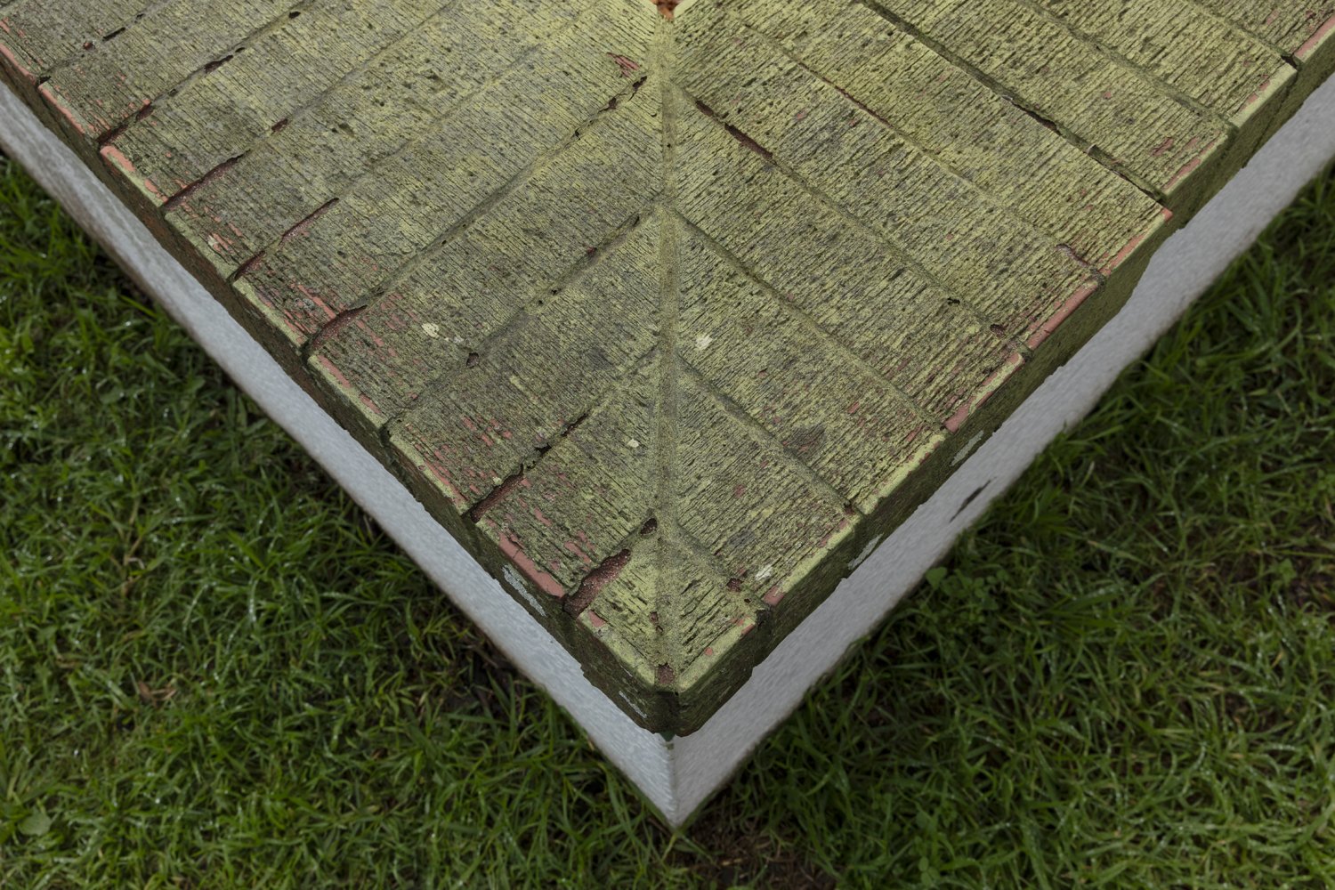
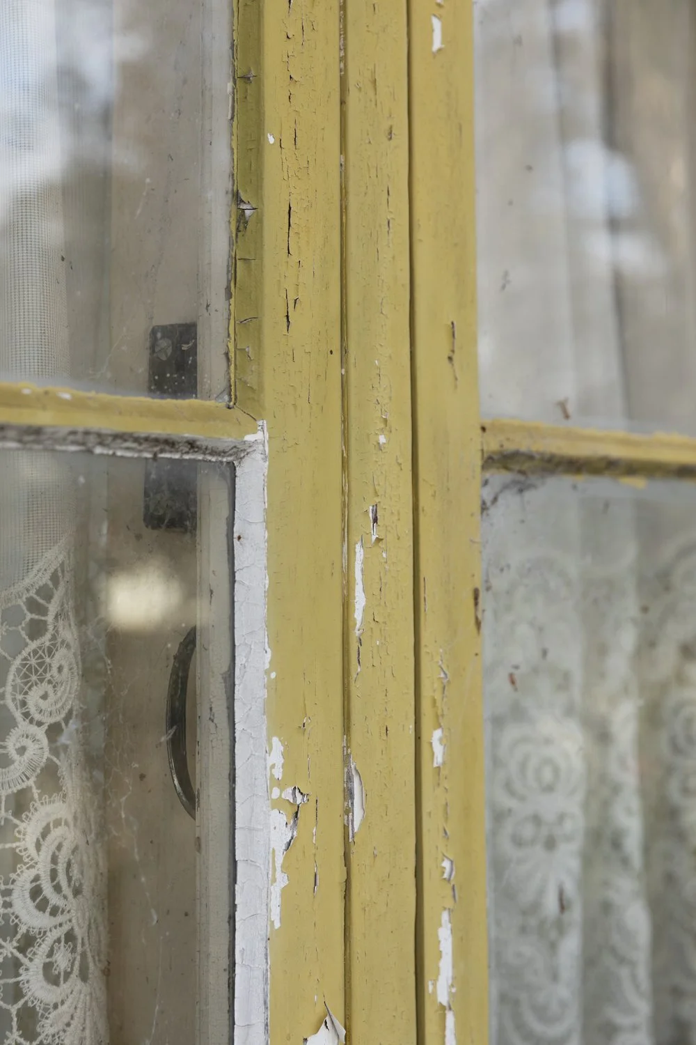
So many thoughts swirling around my head about the series I’m sharing here. I thought it was going to be a fixation to begin with but this is bigger. I’ve long pondered what draws me to the intersection of contradictions; new and old, natural and built, dark and light, straight and curved and so on and thought it was just a matter of visual interest. What I’ve come to realise through much reading, talking and searching is that it’s much deeper than that. It’s a desire to understand the contradictions, the dichotomies, the dualities within myself. There’s too much to say on this to say it all here, but I’ll leave you with this. For all the time I’ve been looking at places where the natural environment meets the built, I thought, as someone who loves and respects nature, that I was cheering for the nature, when actually my heart lies with the built, in this case the house. My metaphor was back to front.
*Side note. There are too many photos here, I know, but in my defence I spent time with this house on two seperate days and took close to 300 photos. It was hard to choose!
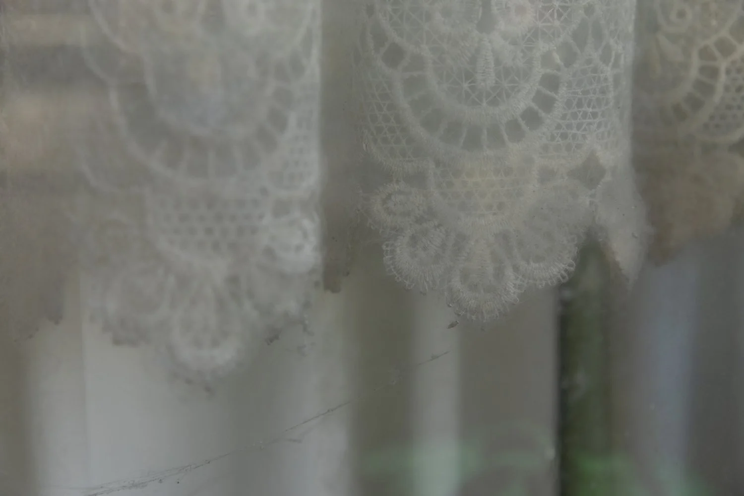
**Side note two, I could have done a fixations series on the lacy curtains alone.
Fixations 5
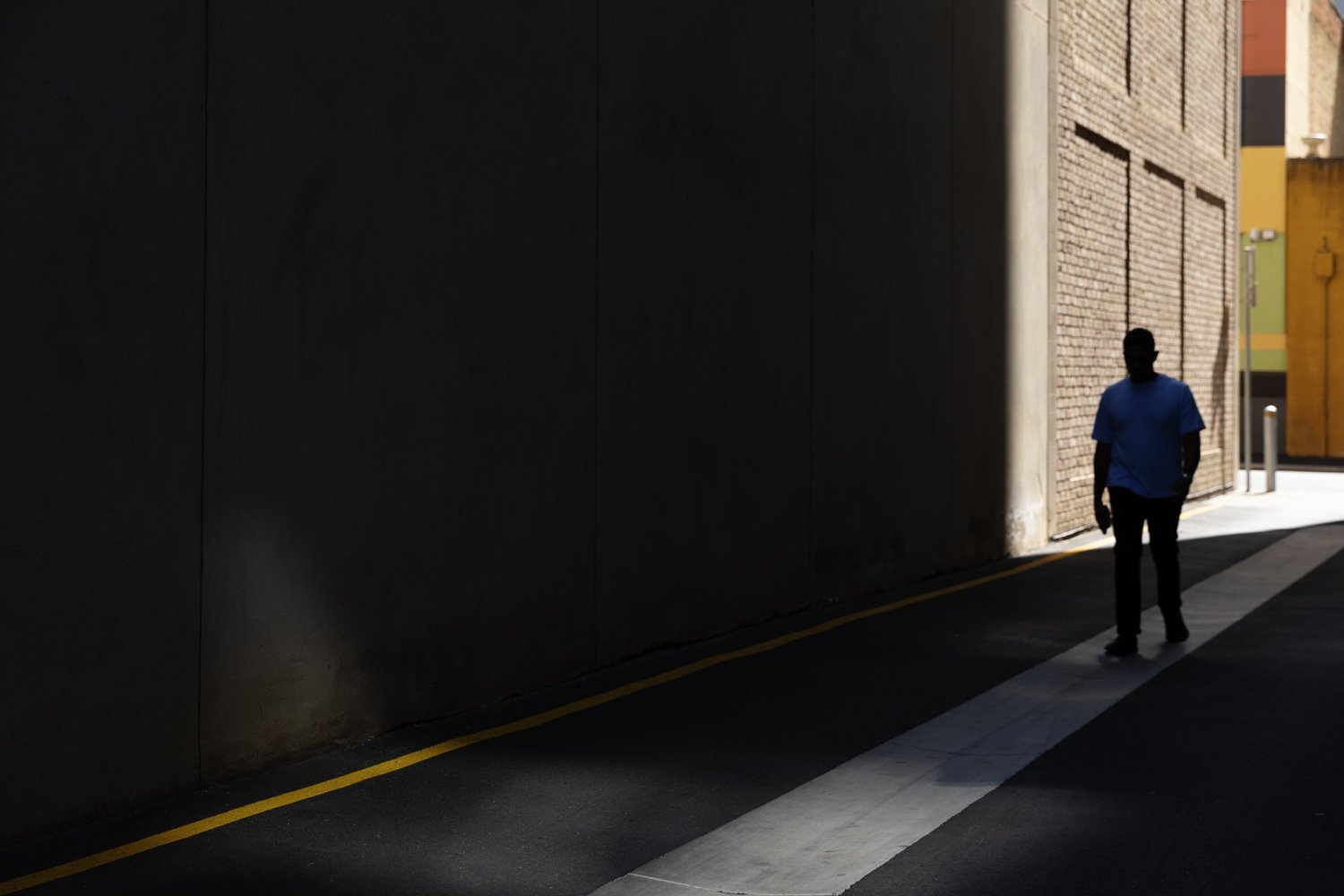
Fixations 5. Still in Adelaide (not now, at the time of taking). If you’ve been following this series of me obsessing over fairly ordinary things, you can probably tell me what I love about this little scene… but in case you haven’t, here it is… colour, obviously. Strong lines and shadows - also obvious. Perhaps less obvious is the contrasting texture of those bricks sitting alongside the smooth concrete and bitumen. And of course there’s that ever present sense of isolation. It was also the way it revealed itself to me as I made my way down the lane. Those colourful little buildings sitting amongst the surrounding concrete giants were like a little oasis in the hot Adelaide sun. That’s all.
Fixations 4
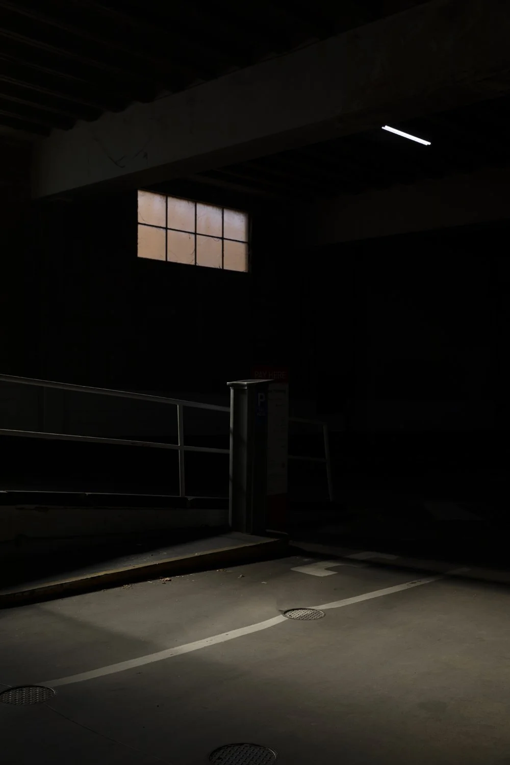
Did you know I have a carpark fetish? Maybe fascination is a better word. In any case, I do. I’ve been wandering in and out of carparks, old and new for many years but like so much of my personal work, it remains unseen. What is it about carparks? It’s all the themes that run throughout this series of fixations and more - strong lines, great colours, concrete, detritus a sense of the extraordinary in the ordinary and that feeling of isolation. The “more” in this instance, is the light - dark, moody, atmospheric and a touch cinematic.
This carpark, in Adelaide, has a very particular and strong memory and feeling attached to it. I was returning to my hotel late in the day when I came across it. It was unclear if it was public or private but unable to resist I went on in and started to shoot. So there I am, snapping away when I heard the roller door start to close! Of course I was too far in to make it back to the door and regardless, as a wise lecturer (2nd year for those in the know) once told me “photographers never run”. Instant panic set it at the thought of being stuck in that dark, moody and no longer atmospheric, just terrifying, carpark.
Fortunately, it turns out it was a pubic carpark and swipe access was not required to leave the exit door in the back, so once my heart rate had settled I continued to snap away! Here’s what I saw:
Fixations 2
A long-time and very dear friend paid a visit to Melbourne in recent months. In one of our many, deep and artful conversations we came to the subject of my “Fixations” posts. She (who will know who she is when she reads this) suggested that you might like to hear about what it is exactly that I am fixating on in these images, what it is that caught my attention.
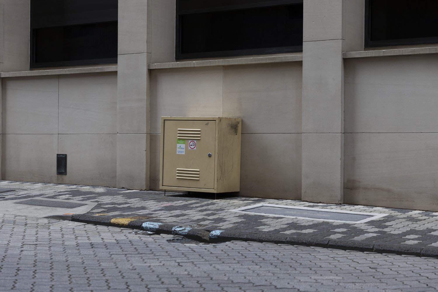
So. This next fixation, I happened upon when working in Hobart earlier this year. This little scene stopped me dead and only got better the more I moved in. It’s the strong lines and repetition in the facade of the building, it’s the patterns in the paving of the road and footpath, it’s the symmetry of the shiny silver bike thingys (what do you call those?), it’s the way nature gently but firmly disrupts the man made perfection with organic, uneven and unpredictable lines. It’s colour - green on stone, the hint of red in the speed sign, the coloured paint on the pavement, the bolt of yellow from the adjacent carpark and the pastel yellow of that strange little, sticker covered, industrial box, which doesn’t belong and fits in all the same. It’s the sense of isolation, the absence of people. I could go on… it’s all of that and more.
For those that are interested it’s the former Reserve Bank building which was designed by the Commonwealth Department of Works and constructed in 1977.

