It’s time to share another of my fixations. Adelaide is still giving here and if you’ve been playing along for a while you can probably tell me what I love about this inner city, industrial scene… feel free to say so in the comments if you’re brave… if you’re new here click the #fixations tag above and you’ll get the idea!
facades


Fixations 5
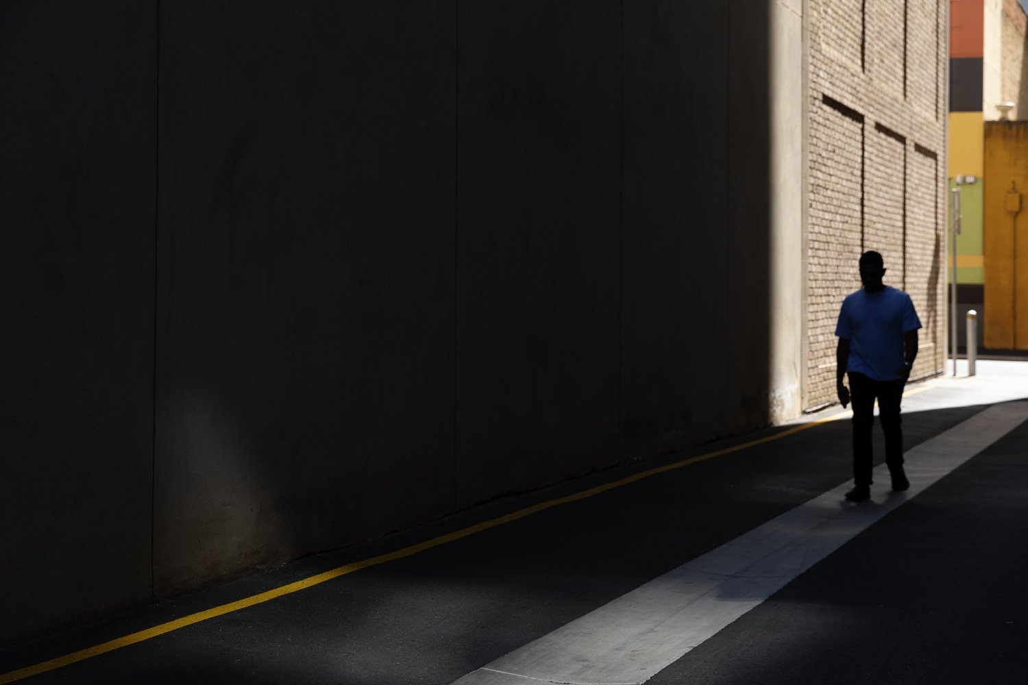
Fixations 5. Still in Adelaide (not now, at the time of taking). If you’ve been following this series of me obsessing over fairly ordinary things, you can probably tell me what I love about this little scene… but in case you haven’t, here it is… colour, obviously. Strong lines and shadows - also obvious. Perhaps less obvious is the contrasting texture of those bricks sitting alongside the smooth concrete and bitumen. And of course there’s that ever present sense of isolation. It was also the way it revealed itself to me as I made my way down the lane. Those colourful little buildings sitting amongst the surrounding concrete giants were like a little oasis in the hot Adelaide sun. That’s all.


Fixations 3
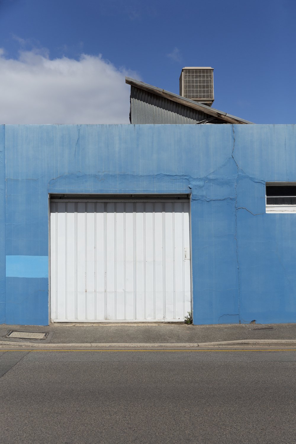
So here we are again. Fixated. This time in Adelaide and quite some time ago. What is it I’m seeing?
Colour plays a part here. The palette of this little scene reminds me, somewhat cringingly and somewhat fondly of a check shirt I wore in the nineties - blue, beige and brown. And I can’t resist a bit of yellow, divisive as it is as a colour.
From colour to texture - organic and manmade - rocks and stone, contrasting with the industrial elements of iron, steel and aluminium.
What else? Lines. Always lines. Lines of different widths and heights and orientations - repeating, crossing, meeting. Curved lines to interrupt the straight. Order in the chaos.
There’s a hint of pareidolia (google it) - though I’m never seeking it or deliberately framing for it.
Finally it’s the little reminders of the natural environment to soften the industrial hardness - soft clouds, palm tree and even a little shadow.
There’s just something about industry that draws me in as it did one of my favourite Australian painters and significant influencer of my work, Geoffrey Smart.


Fixations 2
A long-time and very dear friend paid a visit to Melbourne in recent months. In one of our many, deep and artful conversations we came to the subject of my “Fixations” posts. She (who will know who she is when she reads this) suggested that you might like to hear about what it is exactly that I am fixating on in these images, what it is that caught my attention.
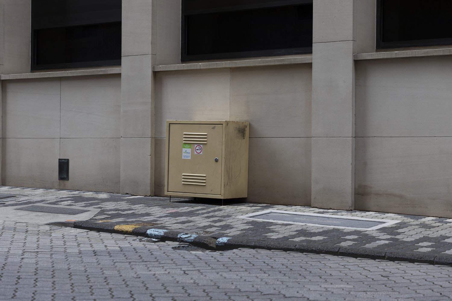
So. This next fixation, I happened upon when working in Hobart earlier this year. This little scene stopped me dead and only got better the more I moved in. It’s the strong lines and repetition in the facade of the building, it’s the patterns in the paving of the road and footpath, it’s the symmetry of the shiny silver bike thingys (what do you call those?), it’s the way nature gently but firmly disrupts the man made perfection with organic, uneven and unpredictable lines. It’s colour - green on stone, the hint of red in the speed sign, the coloured paint on the pavement, the bolt of yellow from the adjacent carpark and the pastel yellow of that strange little, sticker covered, industrial box, which doesn’t belong and fits in all the same. It’s the sense of isolation, the absence of people. I could go on… it’s all of that and more.
For those that are interested it’s the former Reserve Bank building which was designed by the Commonwealth Department of Works and constructed in 1977.


Fixations…
There are few things that give me greater pleasure than being alone with my camera and away from home. This is where I feel most free to explore things that catch my attention or arouse my curiosity. When existing in this space I often find myself fixated on an idea or subject. Most of these stay hidden on my server, never to be shared or seen. With that last thought in mind I decided I’d bring one of those fixations to light…